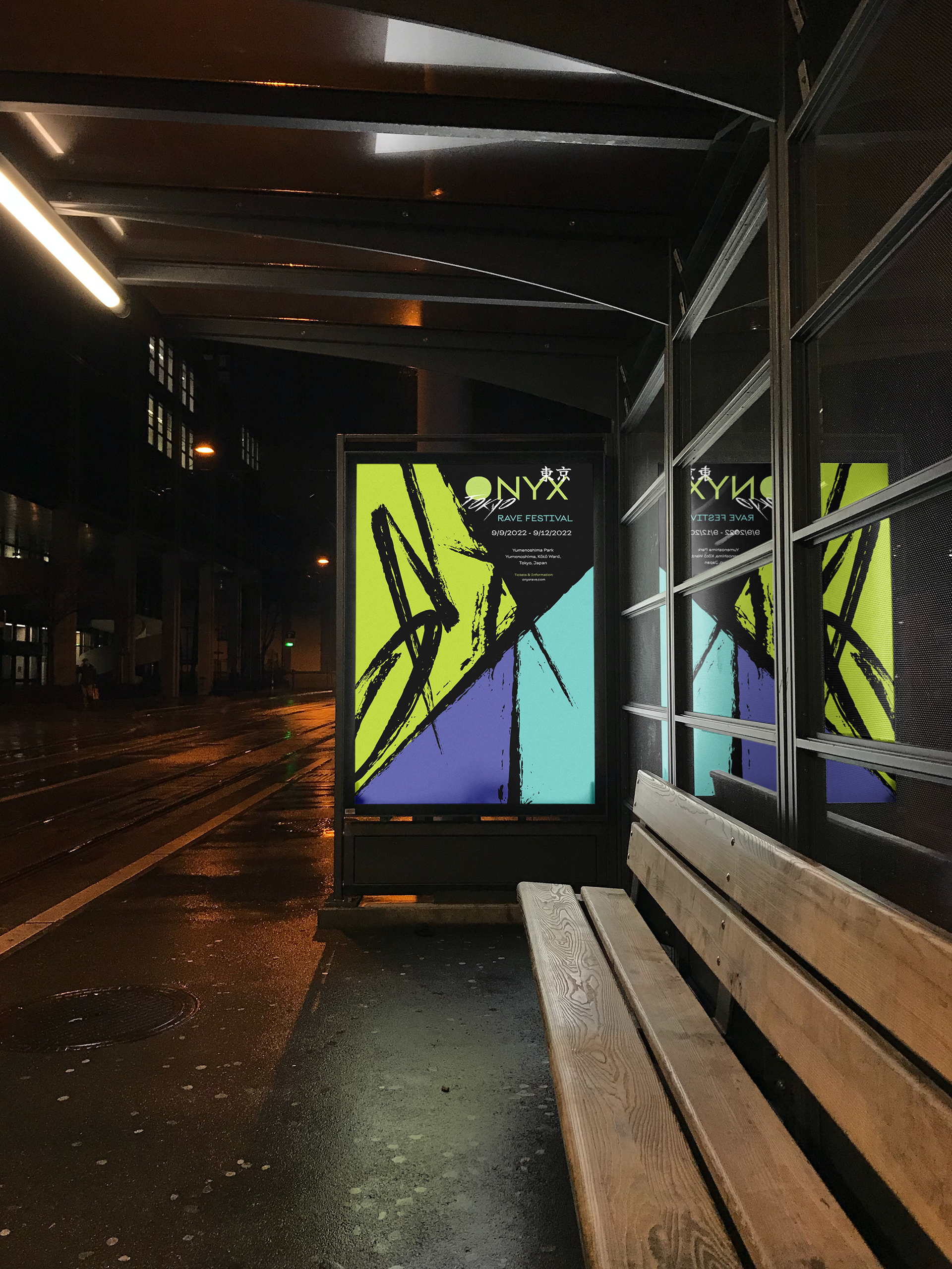
Onyx is a bold, experimental concept for a music festival. Drawing directly from 90s rave culture and in response to the current social landscape, the branding aims to challenge the norms of music festival promotions and marketing. Bright colors, sharp contrast, and dynamic typography that moves and breaks the negative space.
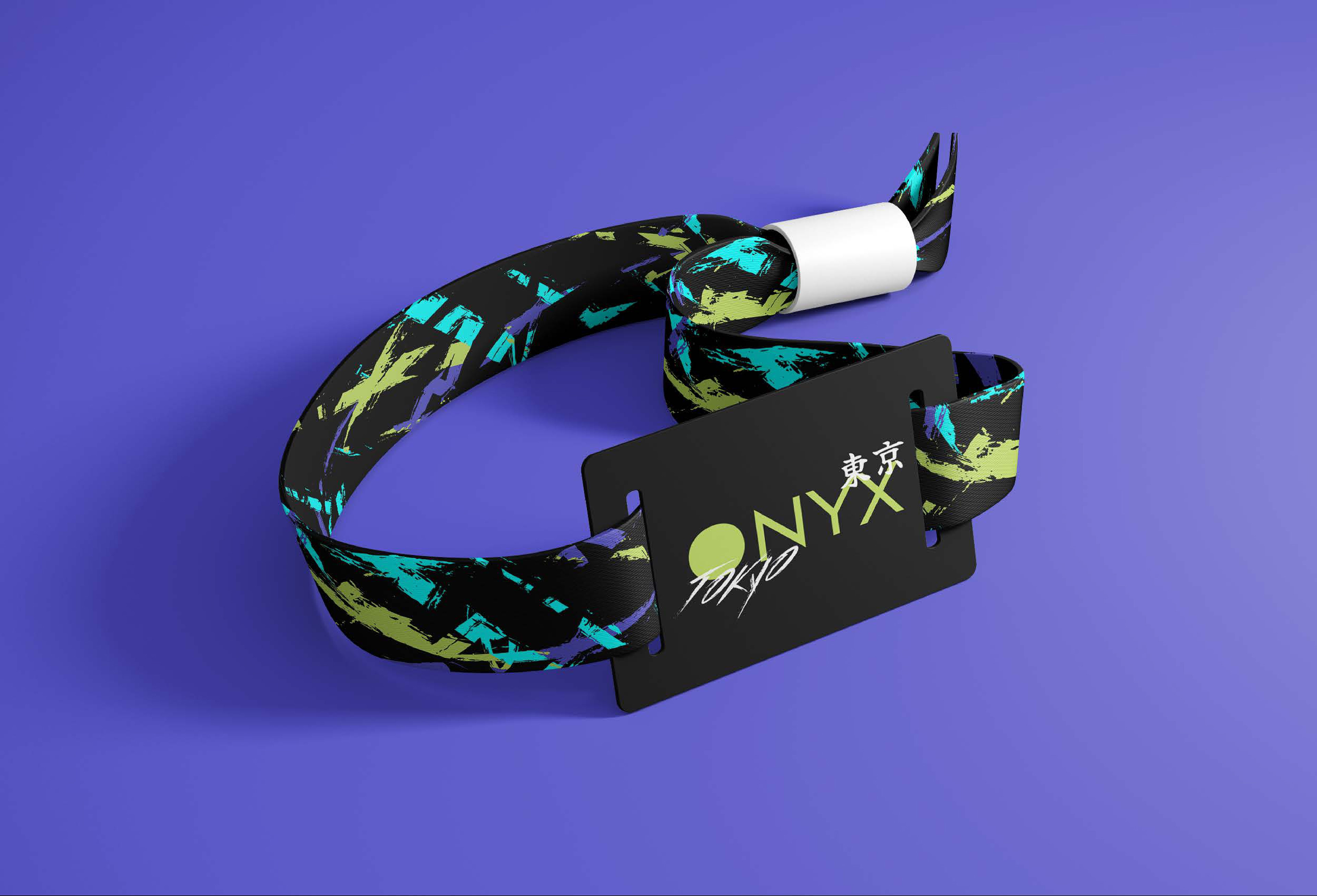
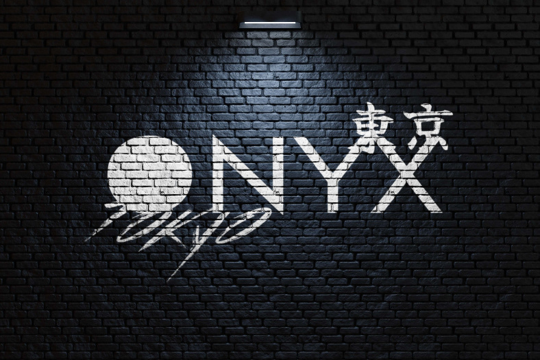
The official wordmark is a simple geometric sans, the "O" representing the moonlit experience of a rave. The second wordmark takes a grunge/graffiti edge, emphasizing the breaking of norms and freedom of expression. The typography is present, unashamed, and loud.
Although raves are anti-establishment and underground, the goal was to bring the underground to the surface, using the use of type to represent that rebellious individuality against the status quo of contemporary festival design.
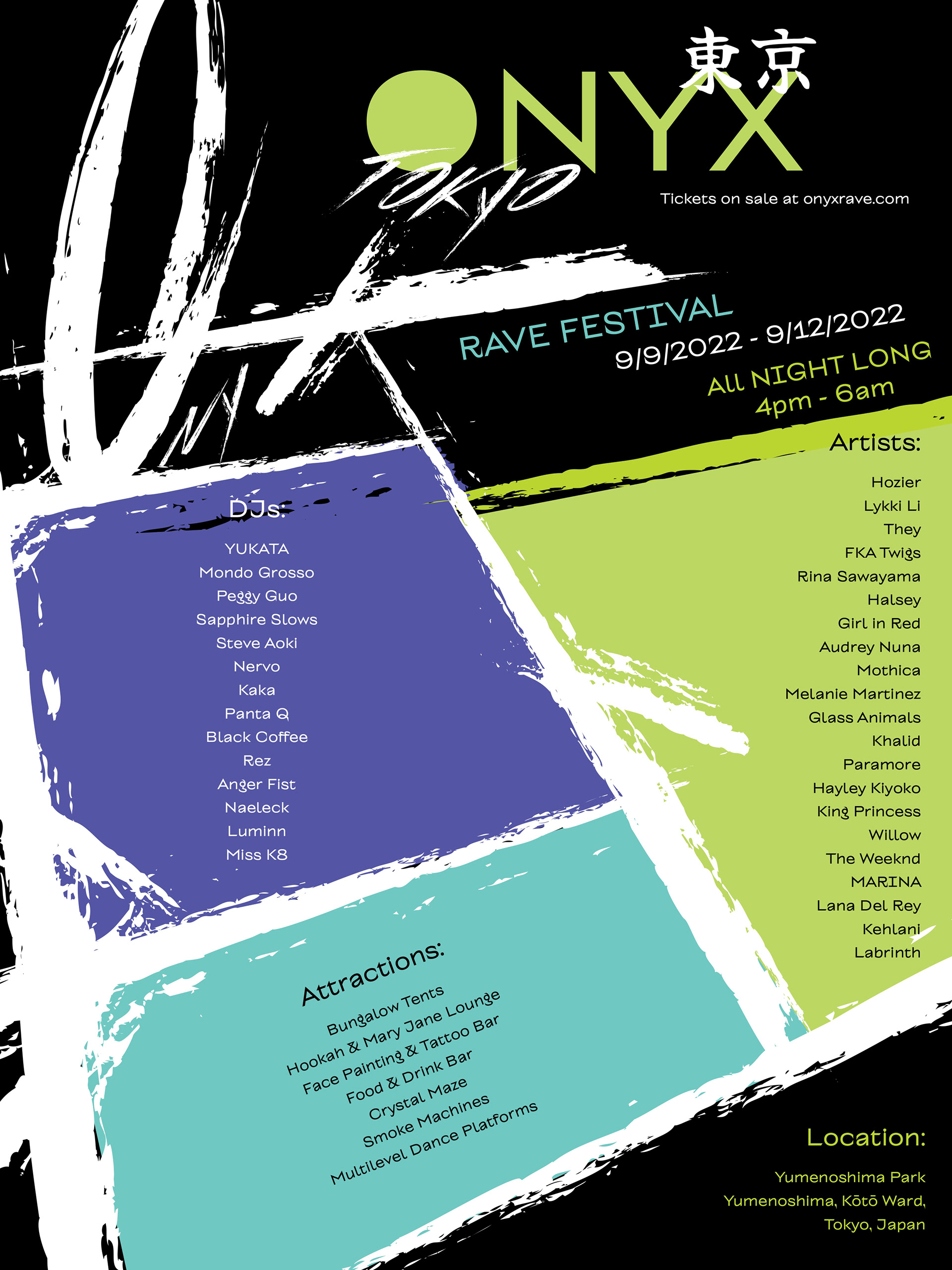
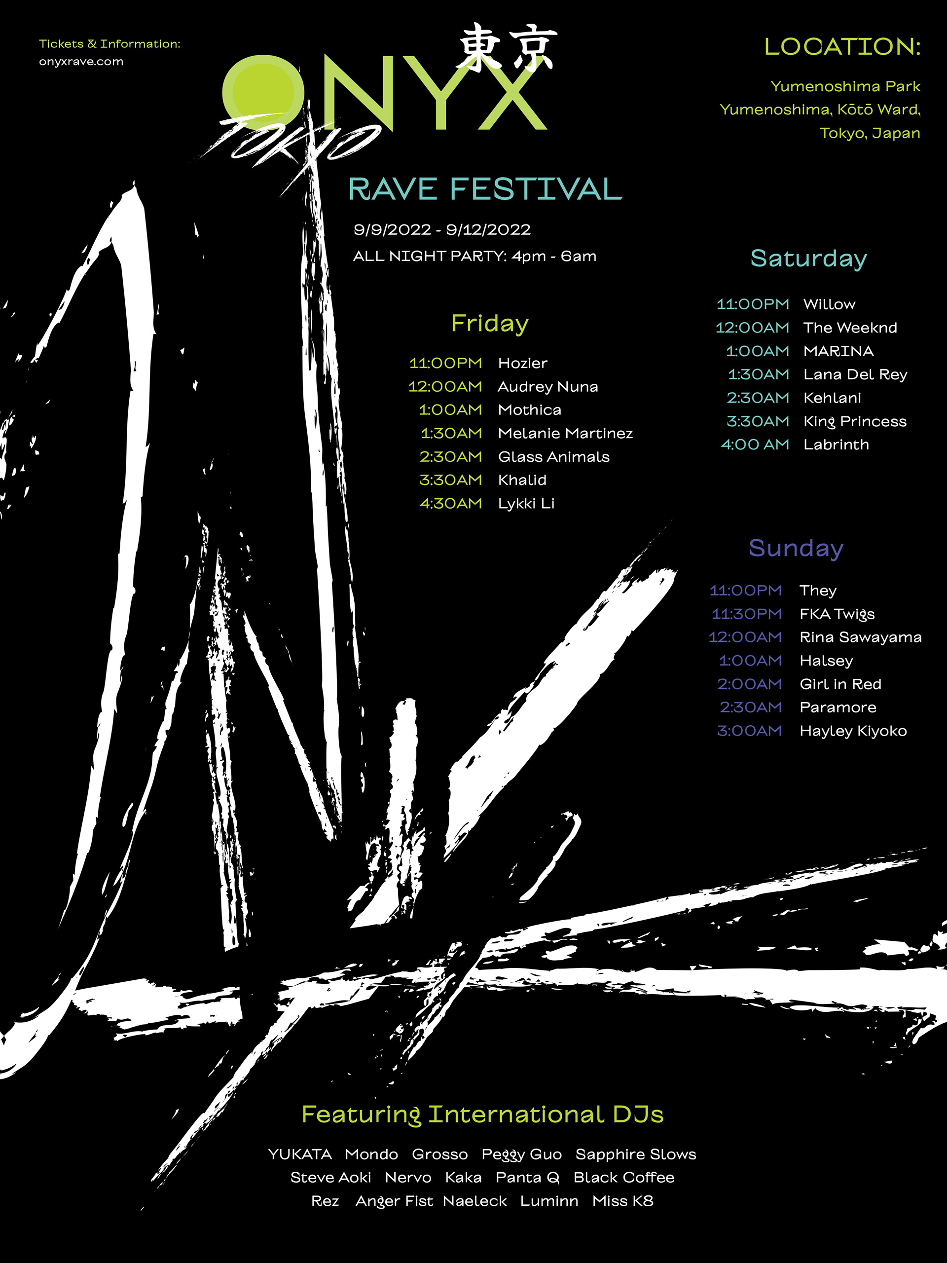
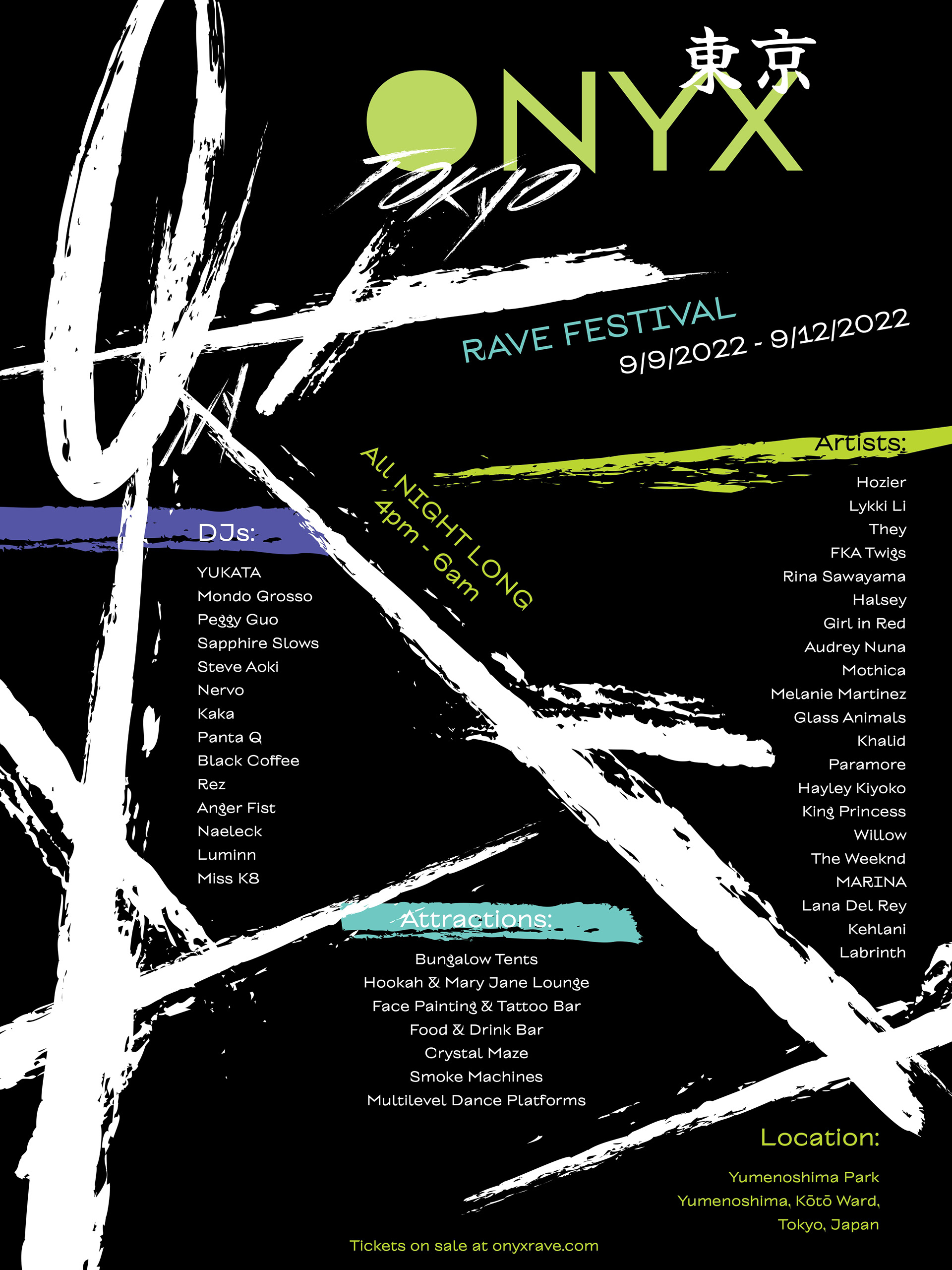
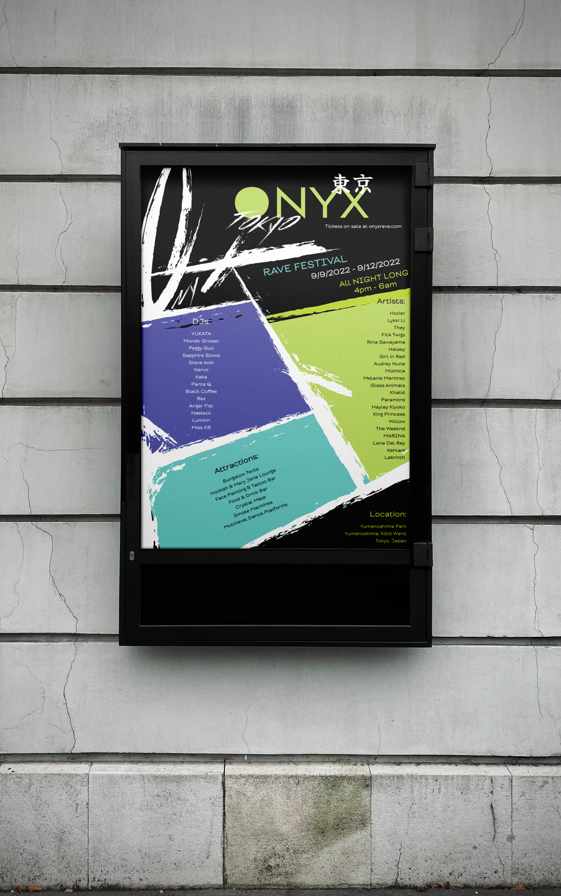
Poster Series
Balancing typographic expression with visual clarity was a challenge on this project. I focused on a vertical list format, tested alignments, and layout against a bold branding system. This poster series embodies the chaotic, rebellious energy of rave culture and history, using color and lettering to balance visual hierarchy and information.
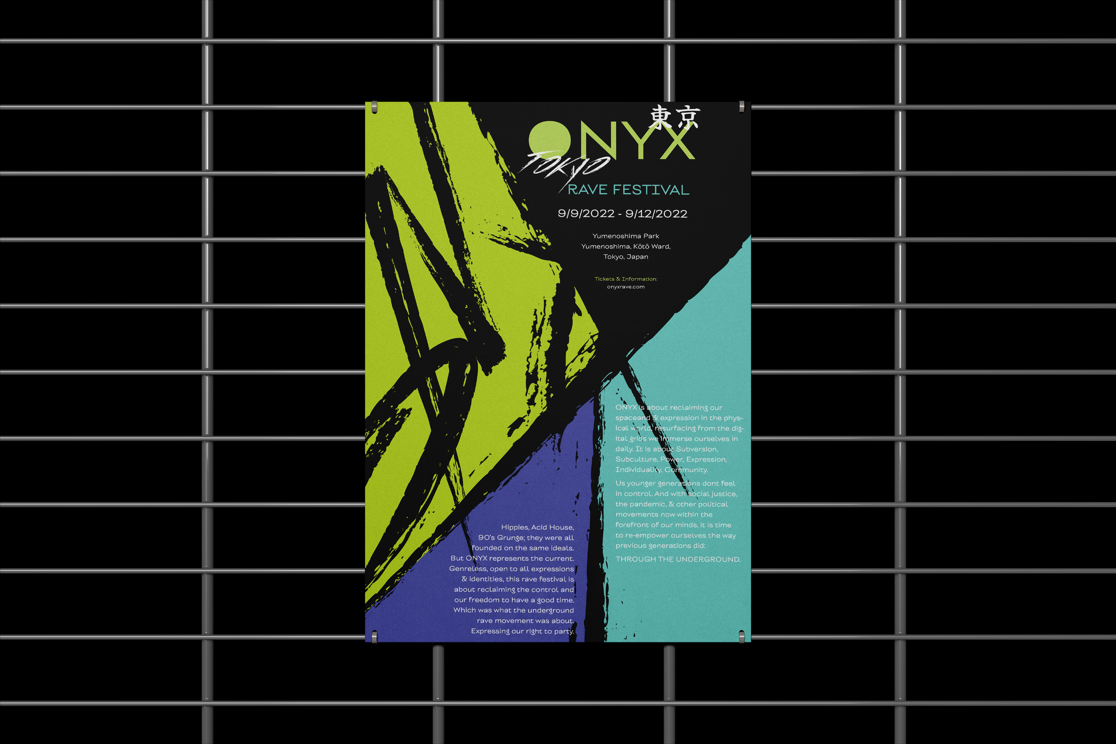
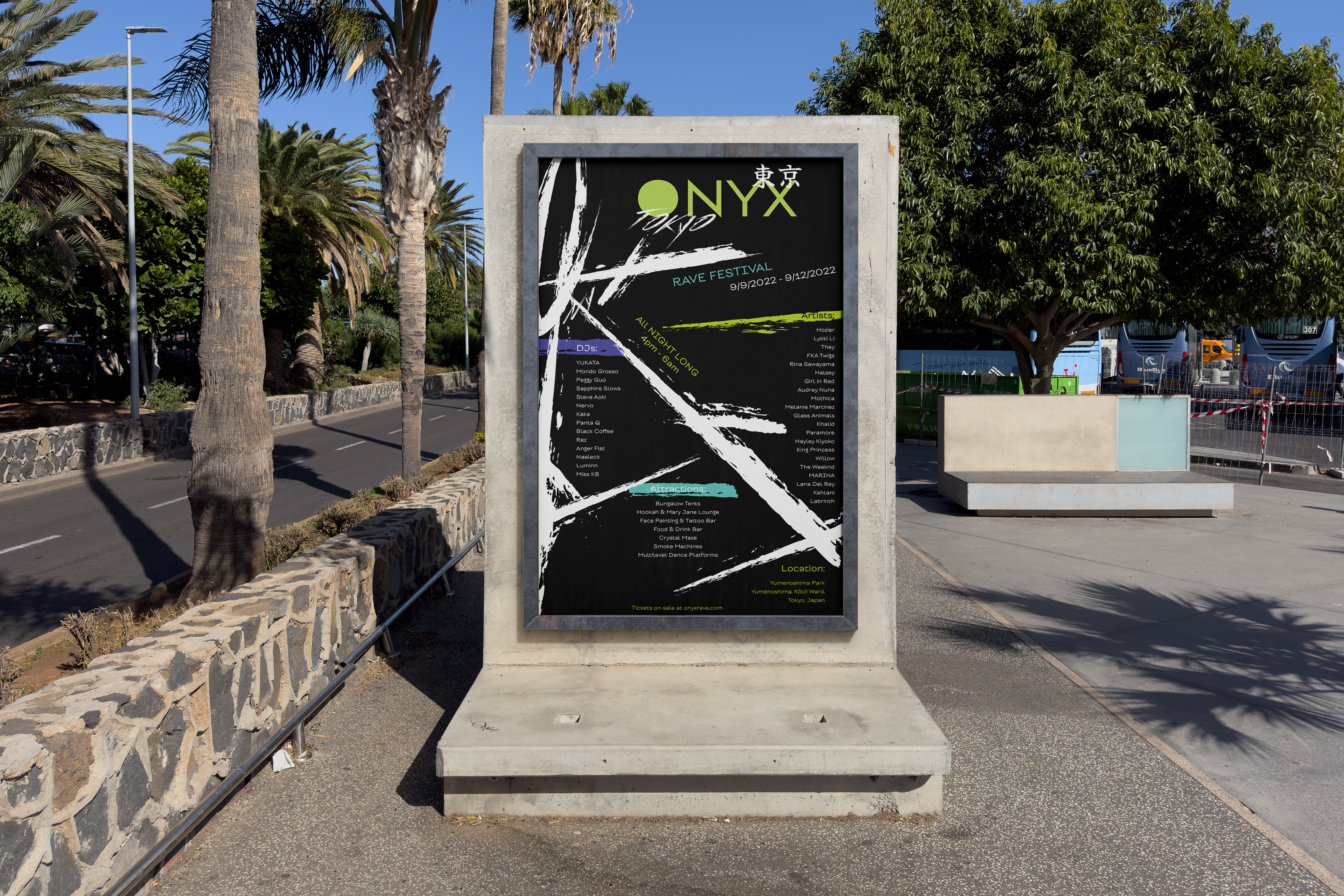
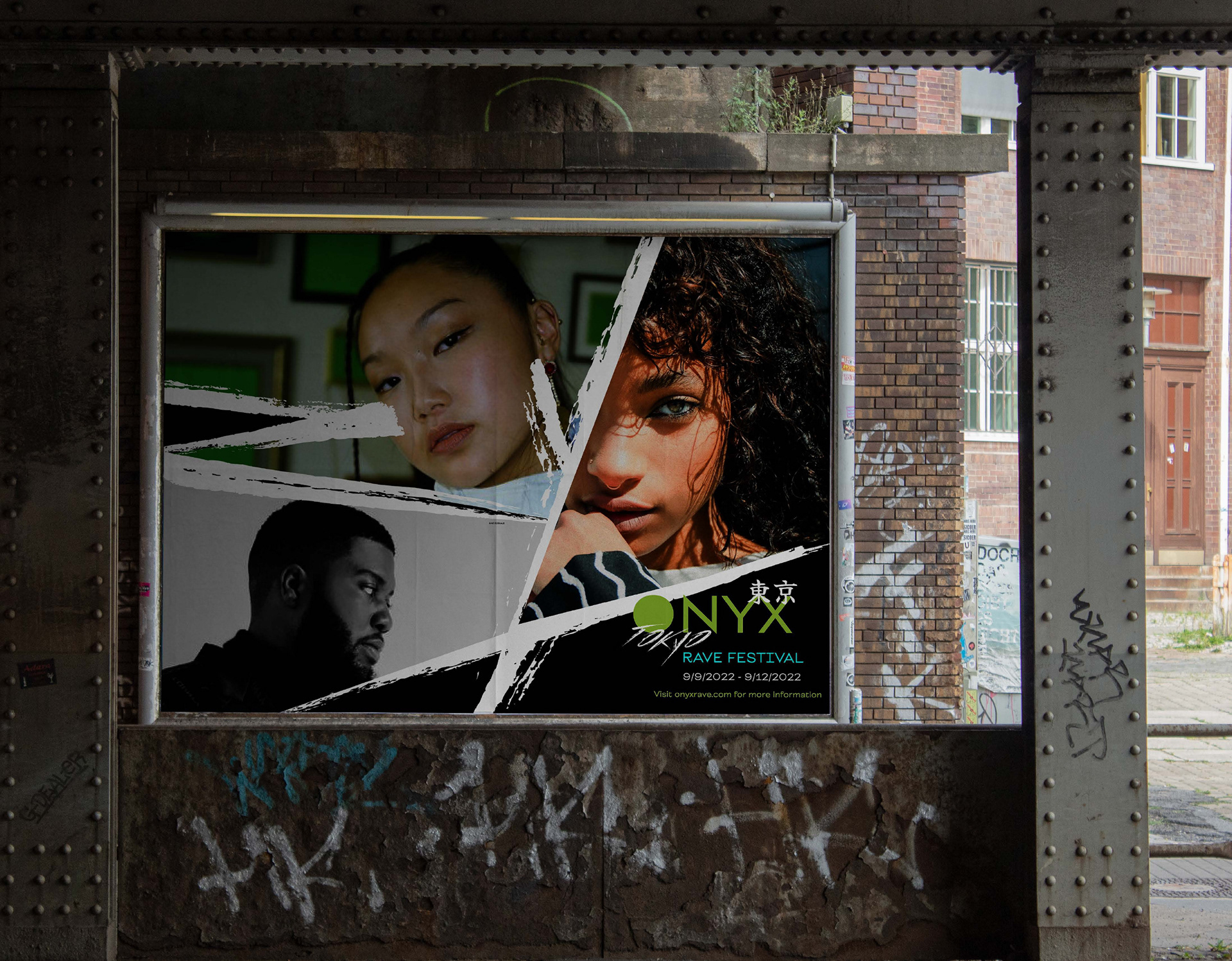
Billboard Concept
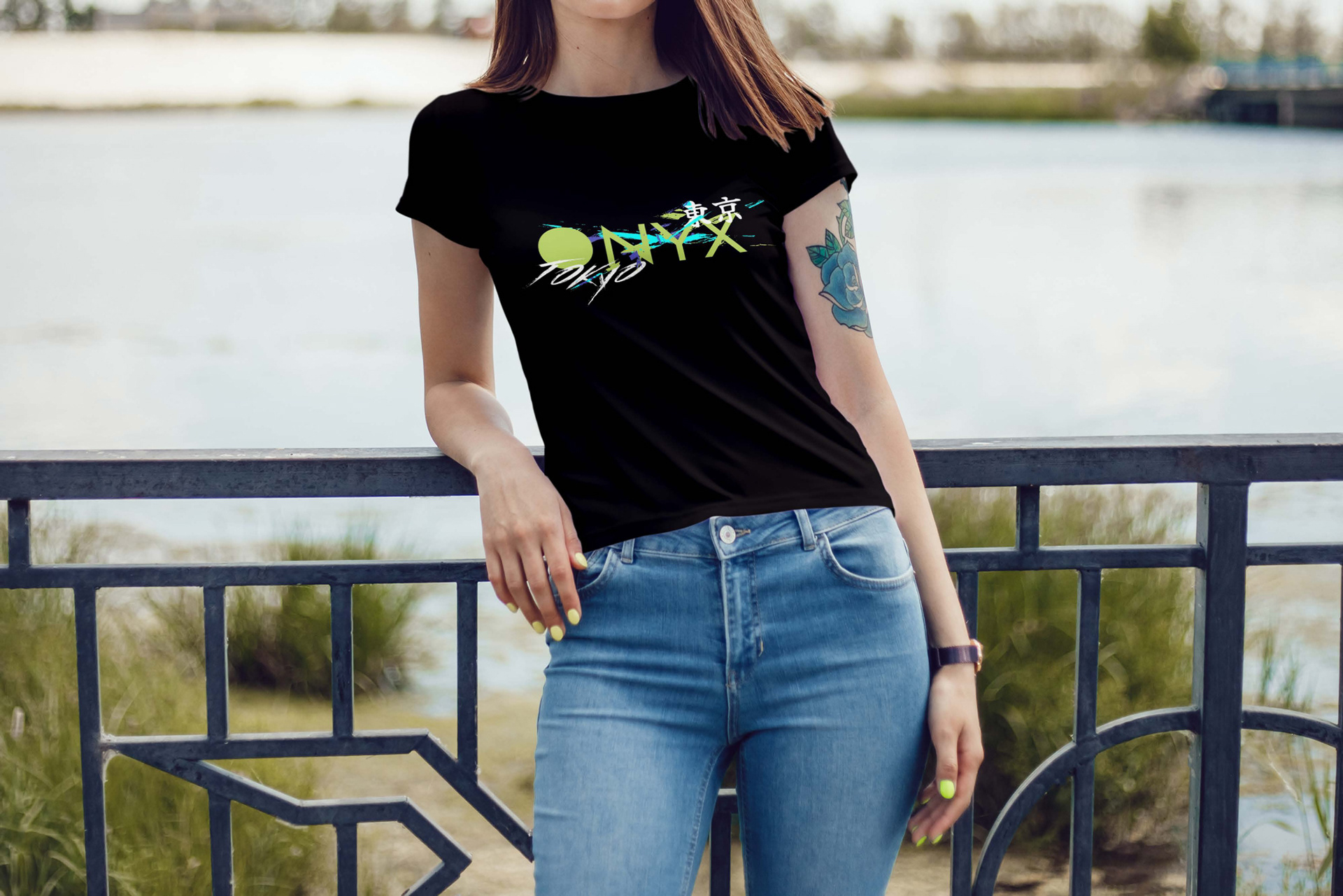
Merchandise